Tag: illustrator
-
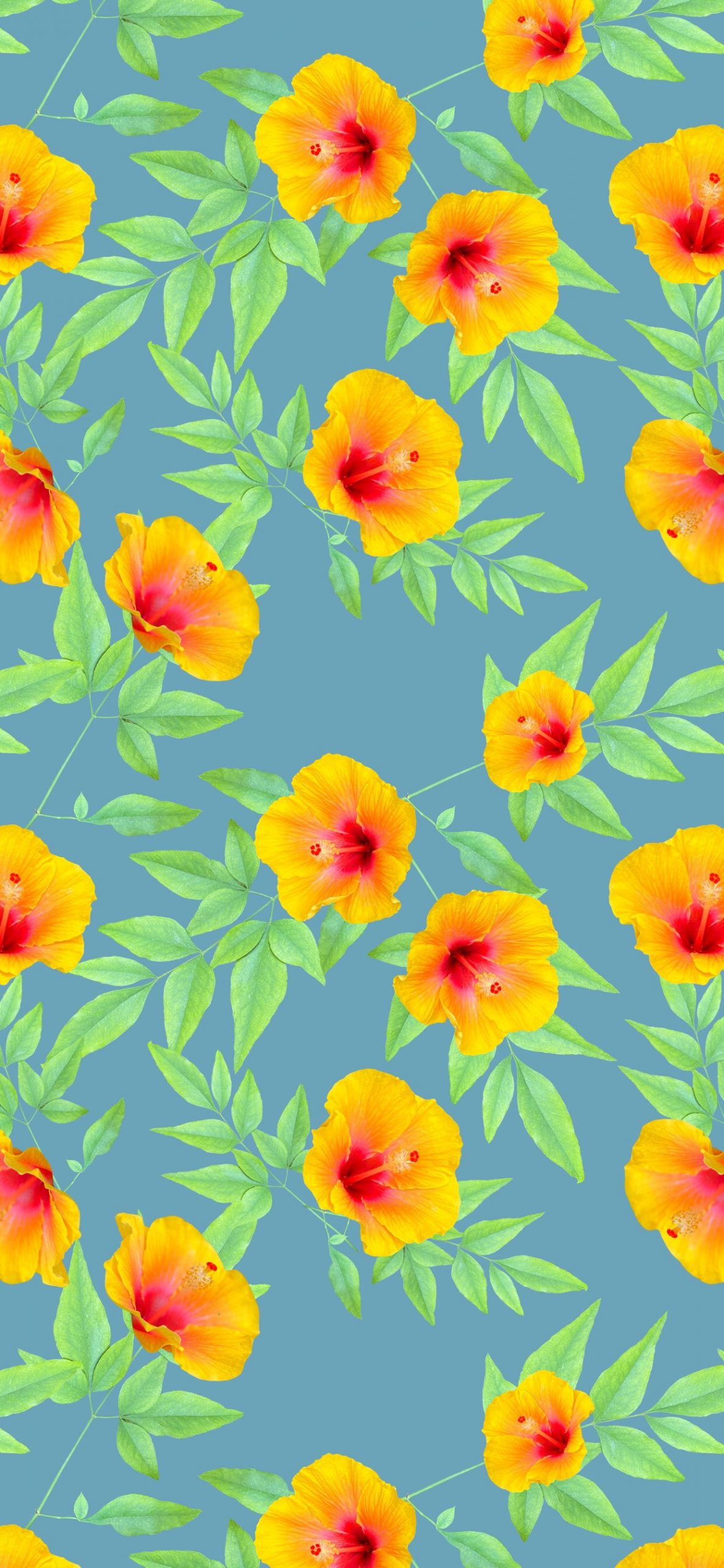
The Process is the Point
This weekend I finally had some quiet time to work on my surface pattern design again. It’s one of those things I pick up from time to time. I love the challenge of it. For a long time, you needed to have a copy of Adobe Illustrator to make seamless digital pattern tiles. Now that…
-
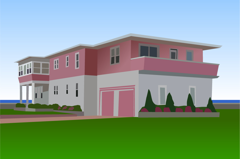
The Pink Beach House
This is the famous Pink Beach House, of Ocean City, New Jersey. Some people call it the Bubble Gum House, because it was owned by Edward Fenimore, who founded the Philadelphia Chewing Gum Corporation. The factory, in Havertown, PA, manufactured such fine products as Swell bubble gum, and El Bubble Gum Cigars. I posted a…
-
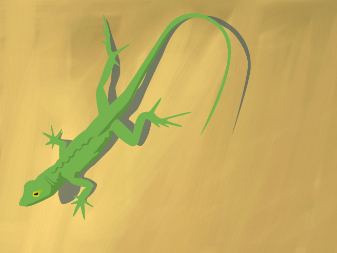
Bahamian Lizard
This is a vectorized lizard drawing based on a photo I took in the Bahamas. The only thing special about this is that I quickly painted a background using the layers app on my iphone, and added it to the sketch. I like the way it roughens up the finished product.
-
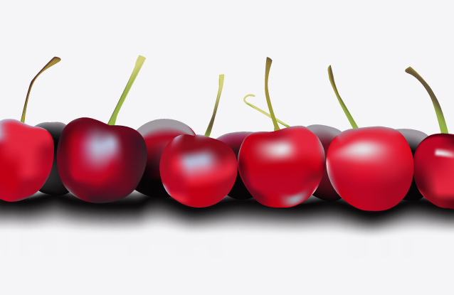
Gradient Mesh Cherries
This is an exercise I did to learn to use the gradient mesh tool in illustrator. It was kind of self indulgent really, as it doesn’t do a thing to advance my drawing skills. It’s just a matter of tracing some shapes from a photo and then mapping them out with gradient meshes. The end…
-
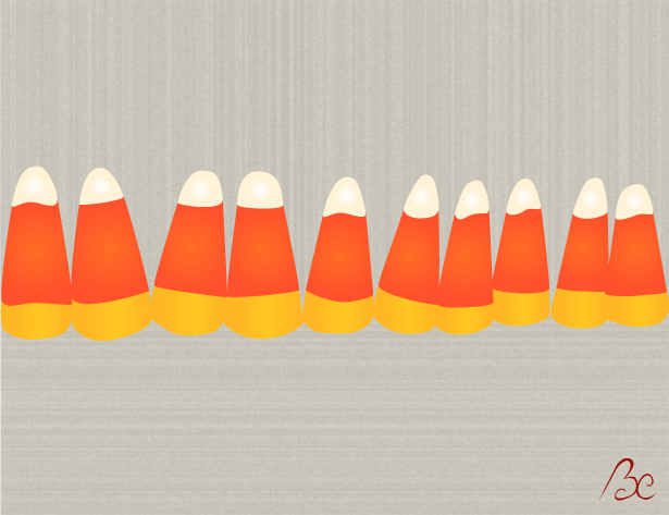
Candy Corn Illustration
Just a simple illustration of some candy corn, done more for practice than anything else. I’m trying to concentrate on 2 things these days: Getting better at illustrator, and finishing projects. I’m starting to understand that the quality of line is the single most important thing in vector graphics and the only way to acheive…
-

Yellow Kimono
This illustration is a vectorized kimono, taken from a photo of a kimono from Japan I’ve had since childhood. Basically I was just trying to work on my illustrator skills, trying to get better with the pen tool. I also used the posterize feature in photoshop until I got the shading I wanted. A simple…